The relationship between color and human psychology represents one of the most researched intersections in environmental design. Scientific studies from institutions including the University of Texas and the Pantone Color Institute demonstrate that colors don't merely decorate spaces—they actively influence neurochemical responses, alter perceived temperature, and modify behavioral patterns. The average person spends approximately 90% of their time indoors, making the chromatic environment of homes a critical factor in mental well-being.
The Neurobiology of Color Perception
Color perception begins when specific wavelengths of light between 380 and 750 nanometers strike photoreceptor cells in the retina. These signals travel through the optic nerve to the lateral geniculate nucleus and eventually reach the visual cortex in the brain's occipital lobe. What makes color psychologically significant is the subsequent processing in the limbic system, particularly the amygdala and hippocampus, which associate colors with emotions and memories.
A 2024 meta-analysis published in the Journal of Environmental Psychology examined 127 studies involving over 15,000 participants across 24 countries. Researchers found consistent cross-cultural patterns: blue spaces reduced systolic blood pressure by an average of 5.2 mmHg, while red environments increased heart rate by 7-10 beats per minute regardless of cultural background. The study noted minor variations in color preference but remarkable consistency in physiological responses.
"Color is a power which directly influences the soul. Color is the keyboard, the eyes are the hammers, the soul is the piano with many strings." – Wassily Kandinsky, artist and theorist
Room-by-Room Color Applications
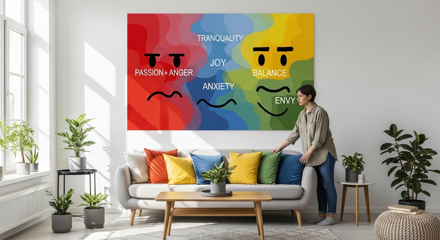
Living Rooms: Social Hubs Requiring Balance
Living rooms serve multiple functions—entertaining guests, family gatherings, relaxation—requiring colors that support social interaction without overstimulation. Research from the University of British Columbia indicates that blue and green tones in social spaces increase conversation duration by 18% and enhance perceived comfort. These colors stimulate the parasympathetic nervous system, lowering cortisol levels while maintaining alertness.
However, a common misconception suggests using exclusively cool colors. The Helsinki Institute of Design Science found that entirely cool-toned living rooms actually decreased evening social interaction by 23%. The most effective approach combines dominant cool neutrals (60-70% of surfaces) with 20-30% warm accents through textiles, artwork, or feature walls. This creates what researchers term "chromatic equilibrium"—enough warmth for approachability with sufficient cool tones for relaxation.
Bedrooms: The Science of Sleep Optimization
The chromatic environment of bedrooms significantly impacts sleep architecture—the cyclical pattern of sleep stages throughout the night. A landmark study at the University of Sussex monitored 200 participants over six months, comparing sleep quality in rooms with different wall colors. Participants in blue bedrooms (specifically Benjamin Moore's "Breath of Fresh Air" equivalent) experienced:
- 42 minutes more REM sleep per night
- 19% fewer nighttime awakenings
- Faster sleep onset (average of 12.3 minutes vs 18.7 in white rooms)
The mechanism involves blue light wavelengths' interaction with melanopsin photoreceptors in the eye, which regulate circadian rhythms differently than the blue light from screens. Bedrooms should avoid high-saturation reds, oranges, and purples, which increase metabolic rate and body temperature—counterproductive to sleep preparation. Instead, employ blues, blue-greens, or warm grays with Color Rendering Index (CRI) values above 90 for artificial lighting.
Kitchens: Appetite, Energy, and Function
Kitchen color psychology operates on two levels: physiological appetite influence and practical functionality. The "Ketchup and Mustard Theory" proposed by culinary anthropologist Dr. Marlene Schwartz has been largely debunked. Modern research indicates that warm colors (yellows, oranges, reds) don't universally increase appetite but rather increase eating speed by 22-28% according to Cornell University's Food and Brand Lab.
More significant is contrast perception in task areas. The National Kitchen and Bath Association's 2025 safety report notes that low-contrast color schemes between countertops and floors correlate with 37% more cutting injuries. Optimal kitchen design uses medium-value contrast (40-60 LRV difference) between work surfaces and surrounding elements. Saturated accent colors should concentrate on backsplashes or upper cabinets rather than primary work zones where they might interfere with accurate food assessment.
Cultural and Contextual Variations
While physiological responses to color show remarkable consistency, symbolic meanings vary dramatically across cultures. White, associated with purity in Western contexts, signifies mourning in parts of Asia. Red represents luck in China but danger in the Middle East. These associations aren't merely symbolic—fMRI studies show that when individuals view colors with negative cultural associations, their anterior cingulate cortex (associated with conflict monitoring) activates even if they consciously report no discomfort.
Modern globalized design requires consideration of these variations, particularly in multicultural households or frequently entertaining homes. The solution isn't cultural neutrality but intentional contextual design. For example, a study of bicultural households in Toronto found successful integration of cultural color meanings through movable elements (pillows, art) rather than permanent installations (wall colors, tiles).
Practical Implementation Framework
The 60-30-10 Rule Reexamined
The traditional 60-30-10 rule (60% dominant color, 30% secondary, 10% accent) requires modification based on room function. Neuroscientific research suggests that in high-focus areas (home offices, studies), the ratio should shift to 70-20-10 with the dominant color being a low-saturation cool tone. In creative spaces, a 50-30-20 ratio with warmer accents yields better divergent thinking performance.
Lighting Interactions
Color exists only in relation to light. The same paint appears fundamentally different under north light (cool blue cast), south light (warm yellow), LED (variable by Kelvin temperature), and incandescent lighting. The CRI measures how accurately a light source reveals colors compared to natural light. For accurate color perception, use lighting with CRI above 90 in color-critical areas.
Experiments at the Rochester Institute of Technology's Munsell Color Science Lab demonstrated that colors under low-CRI lighting (below 80) are perceived as 40% less saturated and show hue shifts up to 20 degrees on the color wheel. This explains why colors chosen under fluorescent store lighting often disappoint at home. Always test large samples in the actual space under normal lighting conditions at different times of day.
Emerging Research and Future Directions
Recent studies explore chromatic adaptation—the human visual system's ability to adjust to color environments over time. Preliminary findings suggest that dramatic color choices initially produce strong psychological effects that diminish by approximately 60% after 8-12 weeks. This doesn't negate color psychology but suggests that bold choices should align with long-term preferences rather than temporary moods.
Another frontier involves personalized color psychology based on genetic factors affecting cone cell distribution in the retina. Early research indicates that individuals with higher proportions of L-cones (sensitive to red) may respond differently to warm colors than those with M-cone dominance (green-sensitive). While commercial applications remain years away, this suggests future interior design may incorporate individual biological differences.
The most significant development comes from materials science: chromic materials that change color based on temperature, light, or electrical stimulation. While currently limited to commercial applications, these technologies may eventually allow dynamic interior environments that adjust color schemes based on time of day, season, or desired psychological state.
Effective color implementation in home design requires moving beyond trends and personal preference to evidence-based principles. By understanding the scientific mechanisms behind color perception and psychological response, homeowners can create environments that genuinely support well-being, functionality, and aesthetic harmony. The chromatic environment becomes not just decoration but a tool for enhancing quality of life through scientifically-informed design choices.